Logo
A distinctive SPARK wordmark with a star-like accent, supported by the FORZA DRINK descriptor.
SPARK — Brand Identity & Packaging Design
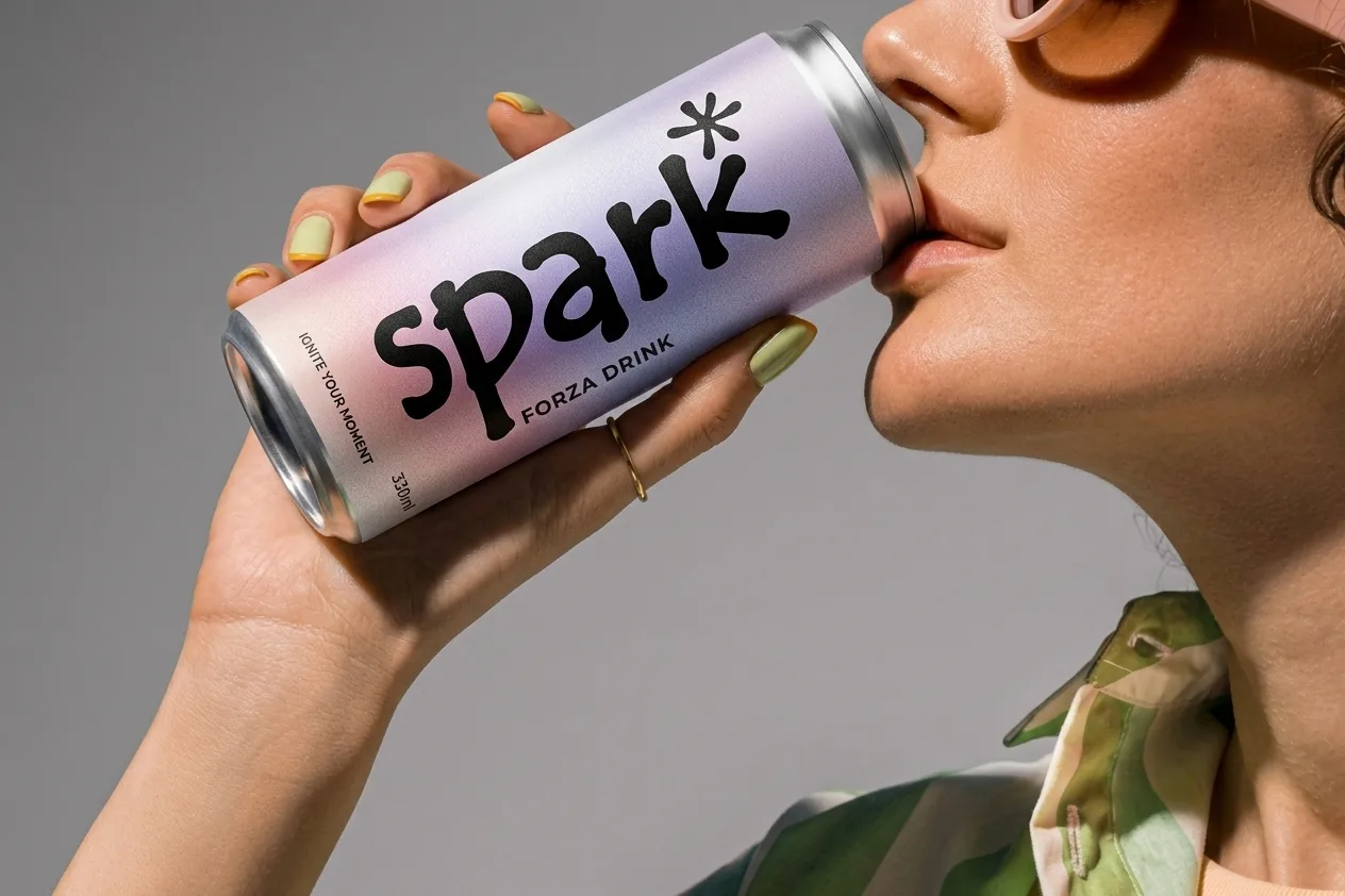
PEMOLAB developed the brand identity and packaging direction for SPARK, a premium 330ml energy drink built around momentum, clarity and creative drive. The visual system pairs a distinctive wordmark with expressive typography, a soft violet-to-coral palette and a packaging design created to stand out across product and lifestyle applications.
SPARK needed a visual identity that could express energy without relying on the familiar visual language of the category. The direction was built around three ideas: momentum, clarity, and a sense of distinction. The aim was to give the product a recognisable personality and a consistent system that could carry across the can, multipack packaging and wider brand communications.
The identity balances an expressive, character-led wordmark with a clean supporting typeface. A restrained base of Spark Black and Chalk is complemented by Spark Violet and Flare Coral, creating a visual language that feels energetic while remaining controlled and recognisable.
The brand’s core pillars—Momentum and Clarity—inform the tone and visual approach: confident, focused and direct. The wider identity is designed to feel premium, contemporary and distinctive.
A distinctive SPARK wordmark with a star-like accent, supported by the FORZA DRINK descriptor.
Tempus Sans as the primary display typeface, paired with Poppins for supporting copy.
Spark Black, Chalk, Spark Violet and Flare Coral, supported by a soft violet-and-coral gradient.
A 330ml can design and a multipack system, with product details and technical layout considerations.
Product imagery, lifestyle-led compositions, campaign-style layouts and brand messaging.
A connected brand identity that gives SPARK a clear visual presence across its core product and supporting applications. From the logo and colour system to the can and multipack packaging, each element works within one recognisable direction.
The brand’s central message brings the system together: premium packed energy to ignite every single creative moment.
Built to move. Designed to stand out.
Explore more work